


Wednesday, November 5, 2008
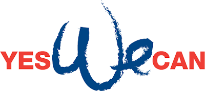
Yes We Can
Since we moved to the South some five years ago from New York, I have been faithful to my dog by taking her on a half hour fast walks everyday around sunrise time. I would meet other dog owners who would stop and ask for my dog’s name to which I would reply that MY name is Ariel, and my dog’s name is Sheebah, and when they would comment on how good looking was my dog, I mistakenly took it as a compliment for myself. Living among southerners meant that I’d be expected to let all know what church I go to, so when I told anyone interested that I was Jewish, and from New York, I heard the comment: ...“then you must be a Democrat.” So I decided to start introducing my dog as the “southerner democrat Jewish dog” to every new walker who bothered to ask for her name. And so I earned the reputation of being the only democrat dog owner in the neighborhood. I also learned to enjoy some bad jokes and to ignore some bad comments. But mostly I had good exchanges. And above all, I thought that a common thread united us all—democrats and republicans alike—we were masters of great dogs. So this morning I took my dog out, passed by our Obama yard sign, and went on to join my fellow republicans dog walkers, on this celebrated day after the election. And there it happened, the most unbelievable sight: My old daily republican friend, whose dog has always stopped to greet and sniff my dog, was passing me without acknowledging my dog or even me. My poor dog could not believe her nose; her best pal just passed her ignoring her! I thought, poor dog, how can I explain her that some republicans will hold a grudge and not join the rest of us, humans and dogs, in celebrating the new future in American history? That’s stupid, I thought to myself, a dog would not understand that.
Friday, September 5, 2008
Politics, weather, and supersized hurricanes
Friends, colleagues, democrats, republicans, but not anarchists;
Politics and weather were on most people’s minds during the past week, and although the hype of politics expired as the republican convention came to a closing, the weather channel continued to pounce with its lively descriptions and warnings of various tropical depressions. If you live in the south, as I do, you learn to enjoy the 8 days it takes for a tropical depression to become a hurricane and reach land, as if you were given a few days extension on life.
The weather “telling” culture has become like a reality show unfolding like a kitsch drama. If you live on the Gulf of Mexico you know what category 1, 2, 3, or 4 can do, but that is no material for a catchy headline. Yet, if you write, as they do, that a “devastating and extremely dangerous category 3 has just entered the gulf”… you are certain to get the attention you want. And then I read about tropical depression Josephine, which, as one reporter wrote, “was struggling to stay organized”. Excuse me? am I expected to get emotional about a storm that is struggling to establish its identity? And to top it all, last week weather.com was advertising a subscription to a Gold Weather Member Card for $24.95! I guess if you became a gold member, you’d be the first to be notified of any tropical depressions being formed in the eastern Atlantic…
This week I was able to find free time between following the disastrous paths of 4 tropical storms, to watch and listen to the opening speeches on the opening night of the republican convention, when I heard Tommy Espinoza giving an emotional speech praising John McCain. He introduced himself as “a Catholic, where Jesus Christ and La Virgen de Guadalupe are at the center of his home”, and said that he was supporting John, first, because of FAITH...
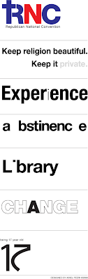
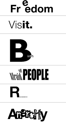
I thought religion was a very private matter and has no place in politics. And I mean any religion, because if you place God in front and first, then everything else becomes God’s will, or even simpler, we do things in the name of God. If you scroll down you will see the visual type statements I made while reacting to some of the buzzwords flying around this week like Change, Ban on books in a library, experience, the RNC and more. No offense, it’s what I like to do best: react visually.
The first sample is how I feel about the republican convention becoming “one party under God”? Please click on the picture below to see it in larger size.
Enjoy
Politics and weather were on most people’s minds during the past week, and although the hype of politics expired as the republican convention came to a closing, the weather channel continued to pounce with its lively descriptions and warnings of various tropical depressions. If you live in the south, as I do, you learn to enjoy the 8 days it takes for a tropical depression to become a hurricane and reach land, as if you were given a few days extension on life.
The weather “telling” culture has become like a reality show unfolding like a kitsch drama. If you live on the Gulf of Mexico you know what category 1, 2, 3, or 4 can do, but that is no material for a catchy headline. Yet, if you write, as they do, that a “devastating and extremely dangerous category 3 has just entered the gulf”… you are certain to get the attention you want. And then I read about tropical depression Josephine, which, as one reporter wrote, “was struggling to stay organized”. Excuse me? am I expected to get emotional about a storm that is struggling to establish its identity? And to top it all, last week weather.com was advertising a subscription to a Gold Weather Member Card for $24.95! I guess if you became a gold member, you’d be the first to be notified of any tropical depressions being formed in the eastern Atlantic…
This week I was able to find free time between following the disastrous paths of 4 tropical storms, to watch and listen to the opening speeches on the opening night of the republican convention, when I heard Tommy Espinoza giving an emotional speech praising John McCain. He introduced himself as “a Catholic, where Jesus Christ and La Virgen de Guadalupe are at the center of his home”, and said that he was supporting John, first, because of FAITH...
I thought religion was a very private matter and has no place in politics. And I mean any religion, because if you place God in front and first, then everything else becomes God’s will, or even simpler, we do things in the name of God. If you scroll down you will see the visual type statements I made while reacting to some of the buzzwords flying around this week like Change, Ban on books in a library, experience, the RNC and more. No offense, it’s what I like to do best: react visually.
The first sample is how I feel about the republican convention becoming “one party under God”? Please click on the picture below to see it in larger size.
Enjoy

Friday, July 25, 2008
Baby boomers: do you have a plan for us?
Since the day when my 7 year old told the cashier at Wal-Mart that we qualify for a discount on the groceries bill, "because my dad", he said, "has just become a member of AARP", I have decided to keep a low profile about my association with the growing AARP membership.
But everything has changed when I received an invitation from the American Marketing Association, It read that since 20 percent of the workforce will be retiring in a few years, it meant the loss of a wealth of institutional knowledge… and it asked " what can we do to retain the critical contribution of these valuable players?”
So I decided to break my low profile state of mind, and regain my self-esteem as a born again “valuable player”.
I always owned a Mac, whether at home or at my studio. I was never part of the Apple cult. Never followed Steve Jobs on his promo concerts. In matter of fact, I felt strange about the fact that as a Mac owner, I had belong to a 4% minority whose voice could not be heard or understood by the rest 96% of the PC owners in the business world.
For my birthday, my kids bought me an iPod Shuffle. It measured only 1.5” by 1”. It was cute and so small. Apple always had a tradition of producing elegant designs, although I thought they were non-functional designs, but they had the right formula for bringing design awards. And this time I had a hunch, before opening my present that some smart creative authority at Apple, will come up with the fantastic idea, that since the product was so cute and so small, everything else should be so cute and so small. No surprise here: I opened the small cute box and grabbed the small cute manual, and got ready to read the small cute type, and I couldn’t. My kid had to read it to me.
Then it was time to use my new iPod, and since I am an avid road biker, I clipped it to my sleeve, inserted the beautifully odd designed earphones into my ears, turned on the iPod and begun riding towards my studio, over the bridge connecting Gulf Breeze to Pensacola, Florida. It did not take long—at almost 100 F and 98% humidity— for both earphones to slide out of my ears. No sweat, I thought, I will put them back on, as I continued riding. Between the cars passing on my left at nearly speed of sound, and me slowing down my bike on a ridiculous narrow road shoulder, I have made an attempt to make sense out of the blurry, light, thin, barely noticeable grey writing on each earphone: was there a way to find which was the Right earphone, and which was the Left? I realized that I didn’t know left from right so I decided to continue my ride without enjoying the ultimate sound experience. About 15 minutes later I arrived to my studio, put my glasses on, and there I saw it: I mean, I hardly saw it. A blurry shape, so thin, and so grey and so pale, and so well hidden: The elegant, baby boomer non friendly, unnoticeable letters R and L.
Conclusion: It’s not about design, you stupid.
Suggestion: Have you heard about color-coding? Hey, kids may like it too.
By Ariel Peeri
Who I am
What do I do


Friday, July 11, 2008
Surveys: Can you get to the point?
In today’s uncertain times, small and large corporations alike, are allocating big budgets to send (more correctly, blast) surveys to assess how their customers think, feel and behave, and what they should do about it.
And yet, so many surveys are missing their targets: the people.
From the few I have seen I can conclude that surveys should not be left in the hands of people who don’t feel compassion for other people... Surveys should be taken out of the hands of people who are data collectors, people who lack communication skills. Surveys should be left in the hands of people who know how to reach through people: not by writing questions that are 3 times longer than their answers, and not by promising that it would take 10 to 15 minutes to finish a survey, when it takes that long to figure out the first question (see below) with its 15 choices; fifteen cramped lines with no room to breath in between, from which I am instructed to choose one answer. I wonder how many people would go directly to the last line “Don’t Know”.
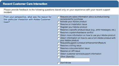
And it does not get better: A question (see below) is 3 times longer—33 words compared to 13 words for answers; Does anybody wants to read so much to answer so little?

Art and Science, as seen as signage on college buildings, for example, is meant to connect the two opposites ends in our culture, just as the name goes: Art and Science. In reality, Art, is a communication skill, and Science is left to the select few who are under no pressure to communicate with the outside. Did we mention that surveys are meant for people? END
Wednesday, May 21, 2008
The power of typography you didn’t care to understand
Did you know that there are over 50,000 fonts available today which are being used to reach consumers eager to respond if only approached by the appropriate type font?
No two letters are alike: a bank who wants to reach the youth market will use wacky fonts, while another letter notifying their parents about a missed payment will use an appropriate straight looking font.
Think of it as a car manufacturer who wants to reach a segmented market by producing range of cars: from black tank-like SUVs all the way down to youthful small cars, and then, everything in between. Consumers react to certain brands the same way they will react to certain fonts. That is the manipulation power of typography.
Typography is about communicating through type
Take for example a no-brainer-straight announcement we received to attend a web conference. The first one, below, is the more communicative of the two. It sets the word date in all caps, on a separate line and by eliminating the space between the times and time zones, and alternating between all caps and lower case, it makes it highly readable.
Sample:
-----------------------------------------------------------
DATE: May 22, 2008
TIME: 10amPT/ 11amMT/ 12pmCT/ 1pmET
-----------------------------------------------------------
The second sample (below) is where most of us mistook the PM for the Pacific Time zone, and missed the conference.
Sample:
--------------------------------------------------------------------
Wednesday, May 7, 2008 4:00 PM - 5:00 PM EDT
--------------------------------------------------------------------
And if you think this is not worth a conversation over dinner, you’re right, but think again: if it were you who sent thousands of announcements you’d be facing a half empty room of attendees who did not read your dates correctly. People don’t read, but skim, and in short time. It is your job as communicator to make them remember what they think they read…
Type has life. It alternate between seeing shapes and understanding meanings. It interacts with the viewer . It causes you to react. In the next illustrations I will show you few samples of my “There's a life in a type”. Today, more than half of the logos I design are type based logo solutions.
Click the image to enlarge

Wednesday, April 30, 2008
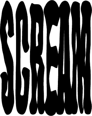
The Scream, not by Edvard Munch
By Ariel Peeri
Founder, ArielStudio.com
As the page begins to unravel, I am settling in a comfortable state of mind eager to read what I agreed to click on the page before. There is still a sort of satisfying thrill from the motion of scrawling and pointing, and the sound of clicking and the sensation of surprise when you are being transferred to the next unknown link.
Suddenly, an advertising square appear at the lower corner of my right eye, and begins to show signs of life; its content begins crawling and moving and shaking up the page, while I try to keep my eyes from turning my head the other direction. I look for the handles of the text column and try grabbing one to narrow its width, and push out the live square ad, but it joins so stubbornly the ranks of pro-life movement and refuses to abort itself. It becomes harder not to try to catch even a glimpse of that moving square, which by now, is moving faster, reaching the speed of 30 frames per seconds, shaking my page violently and trembling my desk top, and I begin to stare at that intruding ad, trying to find who can be blamed for transferring me from a peace minded person to a short tempered warrior filled with unleashed anger.
All I can do is click away to another page, on another story on another web site. I promise myself that I will never become a member of a loyal customer base of that moving brand in the square, and I will boycott the product by uniting all readers of America. But for now all I could do is

No thanks, I have no demand for your brand
It is wildly believed that you cannot brand a product, if there is no need for your product. Last week I received an invitation to attend a webinar presented by the American Marketing Association on "Surviving and thriving with demand generation: how to win more sales-ready leads“. It did sound like a good topic, very timely, since we can all use more sales in a down turn economy, even though I did not receive the official word from the Bush administration that we are in a recession, yet. So I went on reading that marketers across B2B and B2C businesses alike, are essentially concerned with demand generation—they must create demand for their product, service, and brand.
Demand generation? Sounds serious and impressive. New names for marketing techniques are popping every year. It is a trend taking place in marketing: Find a new angle to an already established idea, give it a new buzz title, and you’ll instantly witness the birth of several new specialties, some I found while surfing the web:
Line extensions
Experiential marketing
Influencer seeding
Drip marketing
benefit segmentation
Advertising elasticity
Loss leader
Bleeding edge
If you have good reasons to believe your customers need to buy your product or service, think again: your customers will buy for their reasons. No yours.
The invitation promised that I will learn how to create demand for my product, service and brand. I guessed that if there was no demand for my product, service, and brand, at the end of this webinar I will learn how to create one. I will walk away with a plan that will show consumer that with very little, mindless effort, he/she will soon realize that in fact, they want the product, service, and brand that I offer. Soon they will realize that not having a need does not mean that you shouldn’t be demanding to have the product, service, and brand.
It is a popular practice of many well-established advertising agencies; As for me I say: Thanks, no, I have no need for your client’s product, service, or brand.
by Ariel Peeri
My Bio | About Me
See my work: Ariel Studio.com
Wednesday, March 19, 2008
Perceive whole. Gestalt theorists (1890) were intrigued by the way our mind perceive wholes out of incomplete shapes. We perceive whole at end of a thoughts process. We perceive whole when we feel the need to come to conclusions.
For a mind to perceive whole, it must react. To react is to get involved. And to get involved is what motivates our mind to see whole out of incomplete. That’s the basis for a successful logo design and a happy customer.
The art of logo design—being the purest and simplest form of graphic design— takes on this Gestalt theory. Logos appear minimal, occupy very small real estate space, and seldom grow to be more than a thumb size. A logo must tell a story of a product, service or a company mission through limited number of incomplete shapes or colors. A good logo will send hints of a bigger picture through incomplete shapes in hope of getting the mind of a client to react, get involved and perceive whole out of incomplete shapes.
The total experience (emotional and analytical) of perceiving whole out of incomplete shapes or messages is essential to good brand design.
Whole as an emotional experience
 For example: The arrow (left) is pointing upward at a slight angle. The arrow shape though seems complete, is incomplete: The suggested forward movement does not conclude or ends anywhere. And when you look closely you may see a hint of a 3D shape.
Our mind is trying to make sense of the arrow, it is also reacting in an emotional way: we feel a forward motion, we may feel secure, we may feel as if we are OK with being taken somewhere, but these emotional reactions, though valid, are still too generic (incomplete).
Help is on the way
Let’s add a black square as a hint to a door, and the arrow clearly become a 3D shape, and could be easily identified as a “home”. Add the name of the business “Arrow Homes” and your mind begins experiencing a positive emotion and makes the connection between the arrow and a home, a homebuilder. Furthermore, we may be experiencing a feeling of trust, feeling of stability, security, a positive trust in the future. Our mind has just perceived whole out of partial shapes and incomplete messages. It made sense of an arrow as a logo for Arrow home building business.
Many times our mind cannot interpret incomplete shapes or react emotionally to a logo design and it reacts erratically since the mind is not able to perceive a whole out of incomplete shapes, because we, as creative people, have not provided the mind with the right shapes and/or messages. It is then when we often hear clients commenting with a question "what does it mean?"
Think like others do, see like others see
Naturally, you (the designer) want to help and explain the meaning of your work. By doing so you have just rendered your work meaningless. You will have to work hard and try to detach yourself from what you know, and think through the eyes of others. If you can think as others do, your logo design will help sell the brand, and isn’t it why you were hired for the first place?
So far, I have touched the surface of “critical thinking”, your ability to influence the minds of others complete whole emotional reaction to your design.
I intend to lecture a group of art students at a local college and I thought that it would be a good way to help illustrate critical thinking through understanding the process of branding a political candidate. The following is not an attempt to review a logo, rather, react to a logo.
Is there a message in the logo?
Branding a political candidate is like branding a business that tries to brand its service or product. In our case, the candidate is offering a service, which the consumer may be interested to purchase (by voting).
There are 3 services to choose from, all claiming to be superior to the other two. Compare how their logos help sell their “services”:
OBAMA:
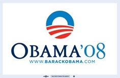 What’s in the logo?
Circular elements, sun, (globe), red stripes drawn in perspective, his last name is in Sans Serif lettering and nicely spaced out, large type, all on white background.
How do I react?
I get the (good) feeling of a (positive) future, kindness, changes, and paths leading to something new. The choice of introducing “08” on one side and his initial letter O on the other side may feel stable, solid. If you try to read loud the word Obama (by imagining the O being much bigger than the rest of the letters) it may sound a bit more authoritative.
The generous space between the letters in the name helps generate a comfortable, at ease feel, non-aggressive, a fine character. The white background is upbeat, since we associate “bright future” with white or light backgrounds colors.
Sometimes we need to have a tag line to accompany the name of a business, if the name alone cannot explain the nature of business, as in the sample of Ted airlines: Ted, alone, is meaningless, but when you add their tag line “Time flies when you fly Ted” we associate the name with an airline.
Take the case of (any) political candidate: the word Obama as part of his logo, does not explain who he is, but when he gives a speech, explaining his views, positions etc., (and each speech is given with his logo showing in the background), we are able to perceive whole out of the incomplete shapes in his logo. It is as if his speeches are becoming his tag line.
HILLARY:
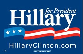 What’s in the logo?
Three stripes, three stars, a banner, her choice of using her first name in large, Serif type with tight spacing between the letters.
How do I react?
I am comfortable as I feel stability, I trust serif type as choice for her name, and the tight letter spacing in her name can make me feel stability, safe, unless I am all for a loose and more open character which is achieved by generous spacing between the letters…
I want to join the movement of the stripe but I realize that it goes “in-and-out” rather than straight up/forward, and that leaves me a bit not “convinced”. The intended three stripes on her logo come across as one stripe, and the 3 stars left behind are left to question why 3 stars?
The Blue, as a background color, helps me react comfortable as I am surrounded by a very protecting and (patriotic) or (corporate) color. Very much like business. And so are her speeches, very detailed, and always referring to long 35 years of experience. I think the logo help her image, yet I am not so sure that now she is comfortable with that image...
McCAIN:
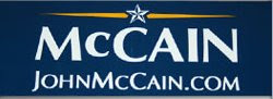 What’s in the logo?
Military style uniform, straight to the point, lots of pointy shapes… A single star, large justified lettering (Sans Serif) of his name, gold and blue colors. A narrow rectangle that is smaller in size than the two other candidates.
How do I react?
Trust, very traditional, conservative, a no, non-sense personality, uncompromising, a bit stubborn, no wasted space, no wasted words, again, a “let’s get to the point” attitude.
Three candidates. Three agendas. Do the logos support their message?
Ariel Peeri
founder
arielpeeri.com
For a mind to perceive whole, it must react. To react is to get involved. And to get involved is what motivates our mind to see whole out of incomplete. That’s the basis for a successful logo design and a happy customer.
The art of logo design—being the purest and simplest form of graphic design— takes on this Gestalt theory. Logos appear minimal, occupy very small real estate space, and seldom grow to be more than a thumb size. A logo must tell a story of a product, service or a company mission through limited number of incomplete shapes or colors. A good logo will send hints of a bigger picture through incomplete shapes in hope of getting the mind of a client to react, get involved and perceive whole out of incomplete shapes.
The total experience (emotional and analytical) of perceiving whole out of incomplete shapes or messages is essential to good brand design.
Whole as an emotional experience
Our mind is trying to make sense of the arrow, it is also reacting in an emotional way: we feel a forward motion, we may feel secure, we may feel as if we are OK with being taken somewhere, but these emotional reactions, though valid, are still too generic (incomplete).
Help is on the way
Let’s add a black square as a hint to a door, and the arrow clearly become a 3D shape, and could be easily identified as a “home”. Add the name of the business “Arrow Homes” and your mind begins experiencing a positive emotion and makes the connection between the arrow and a home, a homebuilder. Furthermore, we may be experiencing a feeling of trust, feeling of stability, security, a positive trust in the future. Our mind has just perceived whole out of partial shapes and incomplete messages. It made sense of an arrow as a logo for Arrow home building business.
Many times our mind cannot interpret incomplete shapes or react emotionally to a logo design and it reacts erratically since the mind is not able to perceive a whole out of incomplete shapes, because we, as creative people, have not provided the mind with the right shapes and/or messages. It is then when we often hear clients commenting with a question "what does it mean?"
Think like others do, see like others see
Naturally, you (the designer) want to help and explain the meaning of your work. By doing so you have just rendered your work meaningless. You will have to work hard and try to detach yourself from what you know, and think through the eyes of others. If you can think as others do, your logo design will help sell the brand, and isn’t it why you were hired for the first place?
So far, I have touched the surface of “critical thinking”, your ability to influence the minds of others complete whole emotional reaction to your design.
I intend to lecture a group of art students at a local college and I thought that it would be a good way to help illustrate critical thinking through understanding the process of branding a political candidate. The following is not an attempt to review a logo, rather, react to a logo.
Is there a message in the logo?
Branding a political candidate is like branding a business that tries to brand its service or product. In our case, the candidate is offering a service, which the consumer may be interested to purchase (by voting).
There are 3 services to choose from, all claiming to be superior to the other two. Compare how their logos help sell their “services”:
OBAMA:
 What’s in the logo?
Circular elements, sun, (globe), red stripes drawn in perspective, his last name is in Sans Serif lettering and nicely spaced out, large type, all on white background.
How do I react?
I get the (good) feeling of a (positive) future, kindness, changes, and paths leading to something new. The choice of introducing “08” on one side and his initial letter O on the other side may feel stable, solid. If you try to read loud the word Obama (by imagining the O being much bigger than the rest of the letters) it may sound a bit more authoritative.
The generous space between the letters in the name helps generate a comfortable, at ease feel, non-aggressive, a fine character. The white background is upbeat, since we associate “bright future” with white or light backgrounds colors.
Sometimes we need to have a tag line to accompany the name of a business, if the name alone cannot explain the nature of business, as in the sample of Ted airlines: Ted, alone, is meaningless, but when you add their tag line “Time flies when you fly Ted” we associate the name with an airline.
Take the case of (any) political candidate: the word Obama as part of his logo, does not explain who he is, but when he gives a speech, explaining his views, positions etc., (and each speech is given with his logo showing in the background), we are able to perceive whole out of the incomplete shapes in his logo. It is as if his speeches are becoming his tag line.
HILLARY:
 What’s in the logo?
Three stripes, three stars, a banner, her choice of using her first name in large, Serif type with tight spacing between the letters.
How do I react?
I am comfortable as I feel stability, I trust serif type as choice for her name, and the tight letter spacing in her name can make me feel stability, safe, unless I am all for a loose and more open character which is achieved by generous spacing between the letters…
I want to join the movement of the stripe but I realize that it goes “in-and-out” rather than straight up/forward, and that leaves me a bit not “convinced”. The intended three stripes on her logo come across as one stripe, and the 3 stars left behind are left to question why 3 stars?
The Blue, as a background color, helps me react comfortable as I am surrounded by a very protecting and (patriotic) or (corporate) color. Very much like business. And so are her speeches, very detailed, and always referring to long 35 years of experience. I think the logo help her image, yet I am not so sure that now she is comfortable with that image...
McCAIN:
 What’s in the logo?
Military style uniform, straight to the point, lots of pointy shapes… A single star, large justified lettering (Sans Serif) of his name, gold and blue colors. A narrow rectangle that is smaller in size than the two other candidates.
How do I react?
Trust, very traditional, conservative, a no, non-sense personality, uncompromising, a bit stubborn, no wasted space, no wasted words, again, a “let’s get to the point” attitude.
Three candidates. Three agendas. Do the logos support their message?
Ariel Peeri
founder
arielpeeri.com
Subscribe to:
Posts (Atom)