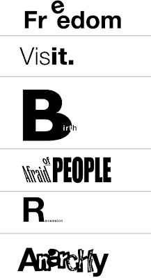
Did you know that there are over 50,000 fonts available today which are being used to reach consumers eager to respond if only approached by the appropriate type font?
No two letters are alike: a bank who wants to reach the youth market will use wacky fonts, while another letter notifying their parents about a missed payment will use an appropriate straight looking font.
Think of it as a car manufacturer who wants to reach a segmented market by producing range of cars: from black tank-like SUVs all the way down to youthful small cars, and then, everything in between. Consumers react to certain brands the same way they will react to certain fonts. That is the manipulation power of typography.
Typography is about communicating through type
Take for example a no-brainer-straight announcement we received to attend a web conference. The first one, below, is the more communicative of the two. It sets the word date in all caps, on a separate line and by eliminating the space between the times and time zones, and alternating between all caps and lower case, it makes it highly readable.
Sample:
-----------------------------------------------------------
DATE: May 22, 2008
TIME: 10amPT/ 11amMT/ 12pmCT/ 1pmET
-----------------------------------------------------------
The second sample (below) is where most of us mistook the PM for the Pacific Time zone, and missed the conference.
Sample:
--------------------------------------------------------------------
Wednesday, May 7, 2008 4:00 PM - 5:00 PM EDT
--------------------------------------------------------------------
And if you think this is not worth a conversation over dinner, you’re right, but think again: if it were you who sent thousands of announcements you’d be facing a half empty room of attendees who did not read your dates correctly. People don’t read, but skim, and in short time. It is your job as communicator to make them remember what they think they read…
Type has life. It alternate between seeing shapes and understanding meanings. It interacts with the viewer . It causes you to react. In the next illustrations I will show you few samples of my “There's a life in a type”. Today, more than half of the logos I design are type based logo solutions.
Click the image to enlarge


No comments:
Post a Comment