For a mind to perceive whole, it must react. To react is to get involved. And to get involved is what motivates our mind to see whole out of incomplete. That’s the basis for a successful logo design and a happy customer.
The art of logo design—being the purest and simplest form of graphic design— takes on this Gestalt theory. Logos appear minimal, occupy very small real estate space, and seldom grow to be more than a thumb size. A logo must tell a story of a product, service or a company mission through limited number of incomplete shapes or colors. A good logo will send hints of a bigger picture through incomplete shapes in hope of getting the mind of a client to react, get involved and perceive whole out of incomplete shapes.
The total experience (emotional and analytical) of perceiving whole out of incomplete shapes or messages is essential to good brand design.
Whole as an emotional experience
 For example: The arrow (left) is pointing upward at a slight angle. The arrow shape though seems complete, is incomplete: The suggested forward movement does not conclude or ends anywhere. And when you look closely you may see a hint of a 3D shape.
Our mind is trying to make sense of the arrow, it is also reacting in an emotional way: we feel a forward motion, we may feel secure, we may feel as if we are OK with being taken somewhere, but these emotional reactions, though valid, are still too generic (incomplete).
Help is on the way
Let’s add a black square as a hint to a door, and the arrow clearly become a 3D shape, and could be easily identified as a “home”. Add the name of the business “Arrow Homes” and your mind begins experiencing a positive emotion and makes the connection between the arrow and a home, a homebuilder. Furthermore, we may be experiencing a feeling of trust, feeling of stability, security, a positive trust in the future. Our mind has just perceived whole out of partial shapes and incomplete messages. It made sense of an arrow as a logo for Arrow home building business.
Many times our mind cannot interpret incomplete shapes or react emotionally to a logo design and it reacts erratically since the mind is not able to perceive a whole out of incomplete shapes, because we, as creative people, have not provided the mind with the right shapes and/or messages. It is then when we often hear clients commenting with a question "what does it mean?"
Think like others do, see like others see
Naturally, you (the designer) want to help and explain the meaning of your work. By doing so you have just rendered your work meaningless. You will have to work hard and try to detach yourself from what you know, and think through the eyes of others. If you can think as others do, your logo design will help sell the brand, and isn’t it why you were hired for the first place?
So far, I have touched the surface of “critical thinking”, your ability to influence the minds of others complete whole emotional reaction to your design.
I intend to lecture a group of art students at a local college and I thought that it would be a good way to help illustrate critical thinking through understanding the process of branding a political candidate. The following is not an attempt to review a logo, rather, react to a logo.
Is there a message in the logo?
Branding a political candidate is like branding a business that tries to brand its service or product. In our case, the candidate is offering a service, which the consumer may be interested to purchase (by voting).
There are 3 services to choose from, all claiming to be superior to the other two. Compare how their logos help sell their “services”:
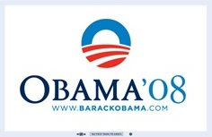
OBAMA:
 What’s in the logo?
Circular elements, sun, (globe), red stripes drawn in perspective, his last name is in Sans Serif lettering and nicely spaced out, large type, all on white background.
How do I react?
I get the (good) feeling of a (positive) future, kindness, changes, and paths leading to something new. The choice of introducing “08” on one side and his initial letter O on the other side may feel stable, solid. If you try to read loud the word Obama (by imagining the O being much bigger than the rest of the letters) it may sound a bit more authoritative.
The generous space between the letters in the name helps generate a comfortable, at ease feel, non-aggressive, a fine character. The white background is upbeat, since we associate “bright future” with white or light backgrounds colors.
Sometimes we need to have a tag line to accompany the name of a business, if the name alone cannot explain the nature of business, as in the sample of Ted airlines: Ted, alone, is meaningless, but when you add their tag line “Time flies when you fly Ted” we associate the name with an airline.
Take the case of (any) political candidate: the word Obama as part of his logo, does not explain who he is, but when he gives a speech, explaining his views, positions etc., (and each speech is given with his logo showing in the background), we are able to perceive whole out of the incomplete shapes in his logo. It is as if his speeches are becoming his tag line.
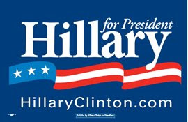
HILLARY:
 What’s in the logo?
Three stripes, three stars, a banner, her choice of using her first name in large, Serif type with tight spacing between the letters.
How do I react?
I am comfortable as I feel stability, I trust serif type as choice for her name, and the tight letter spacing in her name can make me feel stability, safe, unless I am all for a loose and more open character which is achieved by generous spacing between the letters…
I want to join the movement of the stripe but I realize that it goes “in-and-out” rather than straight up/forward, and that leaves me a bit not “convinced”. The intended three stripes on her logo come across as one stripe, and the 3 stars left behind are left to question why 3 stars?
The Blue, as a background color, helps me react comfortable as I am surrounded by a very protecting and (patriotic) or (corporate) color. Very much like business. And so are her speeches, very detailed, and always referring to long 35 years of experience. I think the logo help her image, yet I am not so sure that now she is comfortable with that image...
McCAIN:
 What’s in the logo?
Military style uniform, straight to the point, lots of pointy shapes… A single star, large justified lettering (Sans Serif) of his name, gold and blue colors. A narrow rectangle that is smaller in size than the two other candidates.
How do I react?
Trust, very traditional, conservative, a no, non-sense personality, uncompromising, a bit stubborn, no wasted space, no wasted words, again, a “let’s get to the point” attitude.
Three candidates. Three agendas. Do the logos support their message?
Ariel Peeri
founder
arielpeeri.com

